


"Den säkraste koden är den som aldrig skrivs"
Mobilanpassad hemsida
Använder du inte "Media Queries" i CSS?
https://developer.mozilla.org/en-US/docs/Web/CSS/@media
Här finns en bra lista med rekommenderade "Media Queries" för olika enheter:
https://css-tricks.com/snippets/css/media-queries-for-standar...
Mvh,
WKL.
Visa signatur
Citera flera
Citera
(2)

Skrivet av Ahmadpour99:
Hej!
Jag har skapat en hemsida med kodning, har använt html, css och javascript.
Det jag inte vet är hur gör man för att göra sidan till en iPad eller mobilanpassade storlekar?
Har provat med koden <meta name="viewport" content="width=device-width, initial-scale=1.0">
tyvärr så funkar inte det.
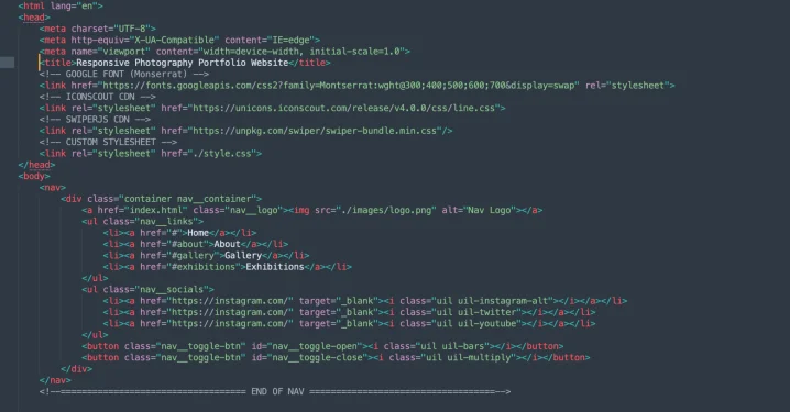
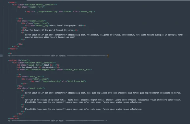
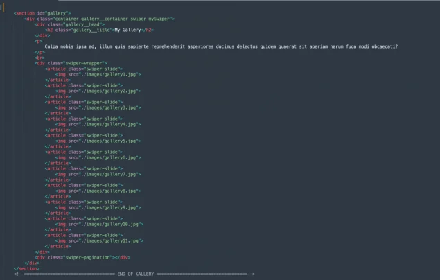
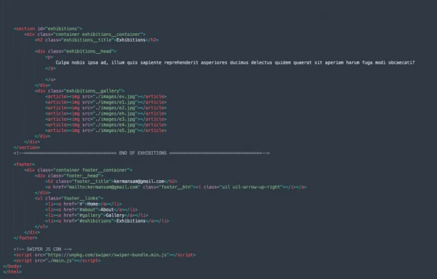
Bifogar bilderna av min index.html fil.
Det här är min index.html
<Uppladdad bildlänk>
<Uppladdad bildlänk>
<Uppladdad bildlänk>
<Uppladdad bildlänk>
Tack för hjälpen!
Mvh Sam
Vad är det som inte funkar? Har du någon bild eller länk till sidan?
Visa signatur
Dator, MOBO: Asus X99-A, CPU: Intel I7 6800k (3.4GHz), GPU: Geforce PNY 2070 Super, RAM: 4x8GB Corsair Vengeance LPX 2400MHz, OS-HDD: Intel 750 PCIe 400GB, PSU: EVGA SuperNOVA G2 850W
Citera flera
Citera
Skrivet av Klorixx:
Vad är det som inte funkar? Har du någon bild eller länk till sidan?
Det är faktiskt svårt och förklara det...
När hemsidan är på helskärm (vet inte varför) men bilden blir rektangulär istället för rund, men när jag gör fönstret mindre till mobilanpassade storlek då går det bra.
Om jag gör till ipad anpassat då biden rör sg bakom texten (och det vill jag inte ha)
Har provat det som #WebbkodsLärlingen skrev, tyvärr försvinner bilderna som jag la.
Har kopierat och klistrat in koden men det går inte, bilderna försvinner helt, finns bara första bilden.
Och sen anpassningen blir inte som ett "vanligt".
Hoppas jag förklarade på mitt bästa sätt och hoppas ni förstår vad jag menar
Tack
Mvh Sam
Citera flera
Citera

Tror det blir lite lättare om du visar din CSS också
Visa signatur
Grubblare
Citera flera
Citera
(1)
Skrivet av Ahmadpour99:
Det är faktiskt svårt och förklara det...
När hemsidan är på helskärm (vet inte varför) men bilden blir rektangulär istället för rund, men när jag gör fönstret mindre till mobilanpassade storlek då går det bra.
Om jag gör till ipad anpassat då biden rör sg bakom texten (och det vill jag inte ha)
Har provat det som #WebbkodsLärlingen skrev, tyvärr försvinner bilderna som jag la.
Har kopierat och klistrat in koden men det går inte, bilderna försvinner helt, finns bara första bilden.
Och sen anpassningen blir inte som ett "vanligt".
Hoppas jag förklarade på mitt bästa sätt och hoppas ni förstår vad jag menar
Tack
Mvh Sam
Inte med på vad du menar här.
Om du inte har en länk till sidan, kan du ta en screenshot på problemet?
Samt bifoga CSSen, så kan jag kanske komma med lite tips på vad du kan kika på.
Visa signatur
Dator, MOBO: Asus X99-A, CPU: Intel I7 6800k (3.4GHz), GPU: Geforce PNY 2070 Super, RAM: 4x8GB Corsair Vengeance LPX 2400MHz, OS-HDD: Intel 750 PCIe 400GB, PSU: EVGA SuperNOVA G2 850W
Citera flera
Citera
Skrivet av Klorixx:
Inte med på vad du menar här.
Om du inte har en länk till sidan, kan du ta en screenshot på problemet?
Samt bifoga CSSen, så kan jag kanske komma med lite tips på vad du kan kika på.
Är det möjligt ladda upp filen?
Eller måste jag ta screenshot för varenda kod av css? Den är lång!
Citera flera
Citera
Skrivet av Klorixx:
Inte med på vad du menar här.
Om du inte har en länk till sidan, kan du ta en screenshot på problemet?
Samt bifoga CSSen, så kan jag kanske komma med lite tips på vad du kan kika på.
Det här är min css kod.. säkert är den ingen bra men ändå..
:root {
    /* ========== GREEN THEME ========== */
    --color-primary: #ff7b02;
    --color-primary-variant: #e5a55d;
    --color-bg-1: #000e17;
    --color-bg-2: #001e2d;
    --color-bg-3: #012734;
    --color-bg-4: #003347;
    --color-light: #85a2b2;
    --color-white: hsl(0, 0%, 90%);

    /* ========== PURPLE THEME ========== */
    /* --color-primary: #ff7b02;
    --color-primary-variant: #e5a55d;
    --color-bg-1: #140021;
    --color-bg-2: #1e0032;
    --color-bg-3: #25003e;
    --color-bg-4: #36005a;
    --color-light: #d0b8e0;
    --color-white: hsl(0, 0%, 90%); */

    --container-width-lg: 88%;
    --container-width-md: 92%;

    --transition: all 400ms ease;
}


* {
    margin: 0;
    padding: 0;
    border: 0;
    outline: 0;
    list-style: none;
    text-decoration: none;
    box-sizing: border-box;
}


::-webkit-scrollbar {
    width: 0.5rem;
    background: rgb(229, 165, 93, 0.2);
}

::-webkit-scrollbar-thumb {
    width: 100%;
    background: var(--color-primary-variant);
    border-radius: 0.25rem;
}

html {
    scroll-behavior: smooth;
}

body {
    font-family: 'Montserrat', sans-serif;
    background: var(--color-bg-3) url('./fes/bg-texture.png');
    color: var(--color-light);
    line-height: 1.7;
}

h1, h2 {
    line-height: 1.1;
    font-weight: 400;
}

h1 {
    font-size: 4rem;
    color: var(--color-white);
}

h2 {
    font-size: 3.5rem;
}

a {
    color: var(--color-light);
    transition: var(--transition);
}

a:hover {
    color: var(--color-primary);
}

.container {
    width: var(--container-width-lg);
    margin: 0 auto;
    max-width: 2160px;
}

img {
    display: block;
    object-fit: cover;
    width: 100%;
}


/* ========================= NAV ========================= */
nav {
    height: 5rem;
    width: 100vw;
    display: grid;
    place-items: center;
    position: fixed;
    top: 0;
    left: 0;
    z-index: 99;
}

/* nav class on scroll using javascript */
.window-scrolled {
    background: var(--color-bg-2);
    border-bottom: 0.2rem solid var(--color-bg-3);
    box-shadow: 0 1rem 1rem rgba(0, 0, 0, 0.3);
}

.nav__container {
    height: 100%;
    display: flex;
    justify-content: space-between;
    align-items: center;
}

/* only need on tablets and phones */
.nav__toggle-btn {
    display: none;
}

.nav__logo {
    width: 7.5rem;
}

.nav__links {
    display: flex;
    gap: 4rem;
}

.nav__socials {
    display: flex;
    gap: 1rem;
}

.nav__socials a {
    width: 2rem;
    height: 2rem;
    background: linear-gradient(var(--color-primary-variant), var(--color-primary));
    border-radius: 0.5rem;
    color: var(--color-bg-4);
    display: grid;
    place-items: center;
}

.nav__socials a:hover {
    box-shadow: 0 1rem 1rem rgba(0, 0, 0, 0.4);
}


/* ========================= HEADER ========================= */
header {
    max-width: 100vw;
    height: 100vh;
    position: relative;
    top: 0;
    background: linear-gradient(var(--color-bg-3), var(--color-bg-1));
    overflow: hidden;
}

.header__container {
    display: grid;
    grid-template-columns: 43% 53%;
    gap: 4%;
    margin-top: 10rem;
    position: relative;
}


.header__head {
    display: flex;
    gap: 2rem;
    align-items: flex-start;
}

/* general empty styles */
.empty {
    height: 3.5rem;
    width: 18rem;
    background: var(--color-bg-2);
    border-radius: calc(3.5rem / 2);
    margin-bottom: 3.5rem;
    box-shadow: inset 0 1rem 1rem rgba(0, 0, 0, 0.3);
    border: 1px solid var(--color-bg-4);
}

.header__tag {
    color: var(--color-primary-variant);
}

.header__right p {
    margin-top: 2rem;
    width: 85%;
}

/* only shows on tablets and phones */
.header__btn-md {
    display: none;
}

.header__frames {
    position: absolute;
    top: 88vh;
    right: 47rem;
    transition: var(--transition);
}

.header__frame {
    width: 14rem;
    border: 0.4rem solid var(--color-bg-3);
    box-shadow: 0 0 4rem rgba(0, 0, 0, 0.5);
    position: absolute;
    transform: rotate(-10deg);
    transform-origin: bottom left;
    transition: var(--transition);
}

.header__frame:nth-child(2) {
    transform: rotate(20deg);
    top: -2rem;
    left: 2rem;
}

.header__frames:hover .header__frame {
    transform: rotate(0);
}

.header__frames:hover .header__frame:nth-child(2) {
    top: 0;
    left: 15rem;
}


/* general style for contact buttons */
.contact__btn {
    color: var(--color-bg-1);
    width: 10rem;
    height: 10rem;
    border-radius: 50%;
    display: grid;
    place-items: center;
    cursor: pointer;
    transition: var(--transition);
}

.header__btn {
    background: linear-gradient(-30deg, var(--color-primary-variant), var(--color-primary), var(--color-primary-variant));
    position: absolute;
    right: 6%;
    bottom: -3rem;
}

.header__btn:hover {
    box-shadow: 0 2rem 2rem rgba(0, 0, 0, 0.3);
    transform: translateY(-1rem);
    color: var(--color-bg-1)
}

.contact__btn i {
    font-size: 3.5rem;
    position: absolute;
}

.contact__btn p {
    font-size: 1rem;
    font-weight: 600;
    width: 10rem;
    height: 10rem;
    display: flex;
    justify-content: center;
    animation: spinText 30s linear infinite;
}

.contact__btn p span {
    position: absolute;
    transform-origin: 0.3rem 5rem;
}

@keyframes spinText {
    to {
        transform: rotate(360deg);
    }
}


/* ========================= ABOUT ========================= */
#about {
    margin-top: 10rem;
    position: relative;
}

.about__container {
    display: grid;
    grid-template-columns: 10rem 26rem auto;
    gap: 3rem;
    position: relative;
    bottom: -100px;
}

.about__title {
    position: relative;
    z-index: 1;
}

.about__btn {
    color: var(--color-primary-variant);
    align-self: end;
}

.about__btn:hover {
    transform: translateY(-1rem);
    color: var(--color-primary);
}

.about__image {
    position: relative;
}


.about__right {
    margin-left: 5rem;
}

.about__right p {
    margin: 0 4rem 1.5rem 0;
}


/* ========================= GALLERY ========================= */
#gallery {
    margin-top: 20rem;
}

.gallery__head {
    display: flex;
    justify-content: space-between;
    margin-border: -70px;
    position: relative;
    top: 100px;
    height: 80px;
}

.gallery__container p {
    width: 45rem;
    position: relative;
    top: 80px;

}

.swiper-wrapper {
    margin-top: 5rem;
    height: 37rem;
    padding-bottom: 5rem;
}

.swiper-slide {
    border: 0.5rem solid var(--color-bg-4);
    height: fit-content;
    max-height: 36rem;
    overflow: hidden;
    transition: var(--transition);
}

.swiper-slide:hover {
    box-shadow: 0 3rem 3rem rgba(0, 0, 0, 0.4);
}

.swiper-slide img {
    filter: saturate(0);
    transition: var(--transition);
}

.swiper-slide:hover img {
    filter: saturate(1)
}

.swiper-pagination-bullet {
    background: var(--color-primary);
}


/* ========================= EXHIBITIONS ========================= */
#exhibitions {
    margin-top: 6rem;
    border: 2px solid aliceblued;

}

.exhibitions__container {
    position: relative;
    position: relative;
    top: 100px;

}


.exhibitions__head {
    display: grid;
    grid-template-columns: auto 10rem;
    justify-content: space-between;
    align-items: center;
}

.exhibitions__head > p {
    width: 45rem;
    position: relative;
    top: 0px;
}

.exhibitions__btn {
    color: var(--color-primary-variant);
}

.exhibitions__btn:hover {
    transform: translateY(-1rem);
}

.exhibitions__gallery {
    display: grid;
    grid-template-columns: repeat(3, 1fr);
    margin-top: 5rem;
    gap: 3rem;
}

.exhibitions__gallery article {
    border: 0.5rem solid var(--color-bg-4);
    transition: var(--transition);
}

.exhibitions__gallery article:nth-child(1) {
    grid-row: 1/3;
}

.exhibitions__gallery article:nth-child(4) {
    grid-column: 2/4;
    grid-row: 2/3;
}

.exhibitions__gallery article img {
    height: 100%;
    filter: saturate(0);
    transition: var(--transition);
}

.exhibitions__gallery article:hover img {
    filter: saturate(1);
}

.exhibitions__gallery article:hover {
    box-shadow: 0 4rem 4rem rgba(0, 0, 0, 0.5);
}


/* ========================= FOOTER ========================= */
footer {
    margin-top: 7rem;
}

.footer__container {
    border-top: 0.5rem solid var(--color-bg-4);
    padding-top: 5rem;
}

.footer__head {
    display: flex;
    align-items: center;
    gap: 2rem;
}

.footer__btn {
    width: 5rem;
    height: 5rem;
    border: 0.2rem solid var(--color-primary-variant);
    border-radius: 50%;
    font-size: 3rem;
    color: var(--color-primary-variant);
    display: flex;
    justify-content: center;
    align-items: center;
    transition: var(--transition);
}

.footer__btn:hover {
    transform: translateY(-1rem);
    border-color: var(--color-primary);
}

.footer__links {
    margin: 3rem 0 5rem;
    display: flex;
    align-items: center;
    gap: 5rem;
}


/*============================= MEDIA QUERIES (medium screens) =============================*/
@media screen and (max-width: 1024px) {
    .container {
        width: var(--container-width-md);
        position: relative;
    }

    h1 {
        font-size: 2.5rem;
        line-height: 1.3;
    }

    h2 {
        font-size: 2.5rem;
    }

    h3{
        font-size: 2.5rem;
    }
    /* =============== NAV ============= */
    .nav__socials {
        display: none;
    }

    .nav__links {
        position: absolute;
        top: 100%;
        right: 0;
        flex-direction: column;
        gap: 0;
        display: none;
        perspective: 400px;
    }

    .nav__links li {
        height: 5rem;
        box-shadow: -3rem 3rem 3rem rgba(0, 0, 0, 0.7);
        animation: navAnimation 600ms ease forwards;
        transform: rotateX(90deg);
        opacity: 0;
        transform-origin: top;
    }

    .nav__links li:nth-child(2) {
        animation-delay: 200ms;
    }

    .nav__links li:nth-child(3) {
        animation-delay: 400ms;
    }

    .nav__links li:nth-child(4) {
        animation-delay: 600ms;
    }

    @keyframes navAnimation {
        to {
            transform: rotateX(0);
            opacity: 1;
        }
    }

    .nav__links li a {
        background: var(--color-bg-4);
        height: 100%;
        width: 100%;
        display: flex;
        align-items: center;
        padding: 1rem 5rem 1rem 3rem;
        border-top: 1px solid var(--color-bg-2);
    }

    .nav__toggle-btn {
        display: inline-block;
        font-size: 2rem;
        background: transparent;
        cursor: pointer;
        color: var(--color-white);
    }

    #nav__toggle-close {
        display: none;
    }


    /* =============== HEADER ============= */
    header {
        height: fit-content;
        padding: 12rem 0 10rem;
        display: grid;
    }


    .header__container {
        grid-template-columns: 40% 54%;
        gap: 6%;
        margin: 0;
    }


 .header_img {
        margin-left: 160px;
        margin-top: 70px;
        width: 200px;
        height: 200px;
        border-radius: 100%;
        overflow: hidden;
        border: 8px solid #ffffff;
        }


    .empty {
        display: none;
    }

    .header__tag {
        margin-bottom: 1rem;
    }

    .header__right p {
        width: 100%;
        margin-top: 1.5rem;
    }

    .header__frames, .contact__btn {
        display: none;
    }

    .header__btn-md {
        background: linear-gradient(135deg, var(--color-primary-variant), var(--color-primary));
        color: var(--color-bg-1);
        margin-top: 2rem;
        display: inline-block;
        padding: 0.6rem 1.6rem;
        font-weight: 600;
        border-radius: 0.3rem;
    }

    .header__btn-md:hover {
        color: var(--color-bg-1);
    }


    /* =============== ABOUT ============= */
    .about__container {
        grid-template-columns: 40% 54%;
        gap: 6%;
        margin-top: -60px;
    }


    .about__image-lg {
        left: 0;
        top: 0;
        filter: saturate(1) brightness(1);
    }

    .about__image:hover {
        border: none;
    }

    .about__right {
        margin: 0;
    }

    .about__right p {
        margin-bottom: 1rem;
    }


    /* =============== GALLERY ============= */
    #gallery {
        margin-top: 8rem;
    }

    .gallery__container p {
        width: 100%;
        margin-top: 2rem;
    }

    .swiper-wrapper {
        margin-top: 4rem;
        height: fit-content;
    }


    /* =============== EXHIBITIONS ============= */
    .exhibitions__head > p {
        width: 100%;
        margin-top: 2rem;
    }

    .exhibitions__gallery {
        margin-top: 3rem;
        gap: 1rem;
    }

    .exhibitions__gallery article {
        border: none;
    }

}


/*============================= MEDIA QUERIES (small screens) =============================*/
@media screen and (max-width: 600px) {
    h1, h2 {
        font-size: 2rem;
        line-height: 1.3;
        color: var(--color-white);
    }

    header {
        padding: 0;
        padding-bottom: 6rem;
    }

    .header__container {
        grid-template-columns: 1fr;
        gap: 1rem;
        text-align: center;
    }

    .header__image-lg {
        width: 80%;
        height: 20rem;
        margin: 0 auto;
        margin-top: 7rem;
        overflow: hidden;
        border-radius: 15rem 15rem 0 0;
    }

    .header__head {
        justify-content: center;
    }

    .header__right p {
        margin-top: 1rem;
    }

    .header__title {
        margin-top: 1rem;
    }


    /* =============== ABOUT =============== */
    .about__container {
        grid-template-columns: 1fr;
        gap: 2rem;
    }

    .about__right p {
        width: 100%;
    }

    .swiper-slide {
        border: 0;
    }


    /* =============== GALLERY =============== */
    #gallery {
        margin-top: 6rem;
    }

    .gallery__container p {
        margin-top: 1rem;
    }

    .swiper-wrapper {
        margin-top: 3rem;
    }


    /* =============== EXHIBITIONS =============== */
    #exhibitions {
        margin-top: 6rem;
    }

    .exhibitions__head {
        grid-template-columns: 1fr;
    }

    .exhibitions__head > p {
        margin-top: 1rem;
    }

    .exhibitions__gallery {
        display: block;
    }

    .exhibitions__gallery article {
        width: 100%;
        height: fit-content;
        margin-bottom: 1rem;
    }


    /* =============== FOOTER =============== */
    .footer__head {
        flex-direction: column;
    }

    .footer__head h2 {
        font-size: 1.5rem;
    }

    .footer__links {
        flex-direction: column;
        gap: 2rem;
        margin-top: 5rem;
    }


}
Citera flera
Citera

https://www.sweclockers.com/forum/trad/1647458-sa-har-lagger-...
Använd ovan.
Du kan även köra spoiler för att gömma det med en knapp.
https://www.sweclockers.com/forum/trad/1539788-faq-sweclocker...
Visa signatur
I7 12700K, Asus RTX 3080 TI, Alienware AW3423DW och annat smått o gott.
Citera flera
Citera
(4)

Skrivet av Ahmadpour99:
Är det möjligt ladda upp filen?
Eller måste jag ta screenshot för varenda kod av css? Den är lång!
Bara kopiera källkoden för både html och css och lägg dem i egna [c0de][/c0de] taggar här i tråden. Ersätt 0a med o
CSS är väldigt kraftfullt och det finns MÅNGA olika sätt att få samma resultat.
Tyvärr så är det väldigt många sätt som går att göra ungefär som man vill men sedan går sönder.
Som nybörjare på CSS kan jag säga att väldigt, väldigt mycket av din tid går till att felsöka css och varför det funkar "ibland men inte annars" etc.... det är helt normalt och tro inte att det bara är du!
Kan tipsa att det är extremsvårt som nybörjare att knycka css av ett annat projekt / guide / whatever och sedan lyckas få den lira korrekt efter att man börjat göra förändringar som man inte riktigt förstår sig på. Men roligt är det
Visa signatur
Citera flera
Citera
(7)
Skrivet av Ahmadpour99:
Det här är min css kod.. säkert är den ingen bra men ändå..
CSS
Bra och bra, jag brukar väl lite skojfriskt säga att det handlar om ifall kod fungerar eller inte, sen kan ju kod nästan alltid förbättras för att det ska vara lättare att underhålla.
Ser ju spontant inga direkta fel, men jag har fortfarande inte förstått exakt vad det är som går fel.
Du har nämnt några bilder som är runda i mobil men inte desktop?
Här skulle jag vilja ha en screenshot och lite förklarande vad du försöker uppnå och hur det funkar/inte funkar just nu.
Visa signatur
Dator, MOBO: Asus X99-A, CPU: Intel I7 6800k (3.4GHz), GPU: Geforce PNY 2070 Super, RAM: 4x8GB Corsair Vengeance LPX 2400MHz, OS-HDD: Intel 750 PCIe 400GB, PSU: EVGA SuperNOVA G2 850W
Citera flera
Citera

Jag antar att bilden som inte längre är rund i helskärm syftar på header_img ?
Åtminstone den bilden är bara rund på mobil/icke-helskärm för att du har
 .header_img {
        margin-left: 160px;
        margin-top: 70px;
        width: 200px;
        height: 200px;
        border-radius: 100%;
        overflow: hidden;
        border: 8px solid #ffffff;
        }
Inuti @media screen and (max-width: 1024px) { ...
Du har inga regler som lägger border-radius på den bilden utöver de du sätter i dina media-queries.
Så när du har en "width" utöver det satt i dina media-queries blir bilden rektangulär i brist på CSS som säger åt den att göra den rund.
Senast redigerat
Förtydligande.
Visa signatur
Ryzen 5600X | MSI Tomahawk | GTX 3070
Citera flera
Citera
Skrivet av Sonywalk:
Jag antar att bilden som inte längre är rund i helskärm syftar på header_img ?
Åtminstone den bilden är bara rund på mobil/icke-helskärm för att du har
 .header_img {
        margin-left: 160px;
        margin-top: 70px;
        width: 200px;
        height: 200px;
        border-radius: 100%;
        overflow: hidden;
        border: 8px solid #ffffff;
        }
Inuti @media screen and (max-width: 1024px) { ...
Du har inga regler som lägger border-radius på den bilden utöver de du sätter i dina media-queries.
Så när du har en "width" utöver det satt i dina media-queries blir bilden rektangulär i brist på CSS som säger åt den att göra den rund.
förlåt... har svårt att förstå vad är det som jag gjort fel
skulle du kunna hjälpa mig med koden?
Citera flera
Citera
Skrivet av Ahmadpour99:
förlåt... har svårt att förstå vad är det som jag gjort fel
skulle du kunna hjälpa mig med koden?
Det som är fel, om jag förstår ditt problem korrekt, är att du satt bilden att vara rund, bara om webbläsarfönstret är under ett visst antal pixlar i bredd.
Sök upp lite mer vad media-queries gör.
Nu gissar jag bara att det är rätt bild jag ens kollar på i CSSen, men testa att ersätta CSSen du skicka med följande:
:root {
    /* ========== GREEN THEME ========== */
    --color-primary: #ff7b02;
    --color-primary-variant: #e5a55d;
    --color-bg-1: #000e17;
    --color-bg-2: #001e2d;
    --color-bg-3: #012734;
    --color-bg-4: #003347;
    --color-light: #85a2b2;
    --color-white: hsl(0, 0%, 90%);

    /* ========== PURPLE THEME ========== */
    /* --color-primary: #ff7b02;
    --color-primary-variant: #e5a55d;
    --color-bg-1: #140021;
    --color-bg-2: #1e0032;
    --color-bg-3: #25003e;
    --color-bg-4: #36005a;
    --color-light: #d0b8e0;
    --color-white: hsl(0, 0%, 90%); */

    --container-width-lg: 88%;
    --container-width-md: 92%;

    --transition: all 400ms ease;
}


* {
    margin: 0;
    padding: 0;
    border: 0;
    outline: 0;
    list-style: none;
    text-decoration: none;
    box-sizing: border-box;
}


::-webkit-scrollbar {
    width: 0.5rem;
    background: rgb(229, 165, 93, 0.2);
}

::-webkit-scrollbar-thumb {
    width: 100%;
    background: var(--color-primary-variant);
    border-radius: 0.25rem;
}

html {
    scroll-behavior: smooth;
}

body {
    font-family: 'Montserrat', sans-serif;
    background: var(--color-bg-3) url('./fes/bg-texture.png');
    color: var(--color-light);
    line-height: 1.7;
}

h1, h2 {
    line-height: 1.1;
    font-weight: 400;
}

h1 {
    font-size: 4rem;
    color: var(--color-white);
}

h2 {
    font-size: 3.5rem;
}

a {
    color: var(--color-light);
    transition: var(--transition);
}

a:hover {
    color: var(--color-primary);
}

.container {
    width: var(--container-width-lg);
    margin: 0 auto;
    max-width: 2160px;
}

img {
    display: block;
    object-fit: cover;
    width: 100%;
}


/* ========================= NAV ========================= */
nav {
    height: 5rem;
    width: 100vw;
    display: grid;
    place-items: center;
    position: fixed;
    top: 0;
    left: 0;
    z-index: 99;
}

/* nav class on scroll using javascript */
.window-scrolled {
    background: var(--color-bg-2);
    border-bottom: 0.2rem solid var(--color-bg-3);
    box-shadow: 0 1rem 1rem rgba(0, 0, 0, 0.3);
}

.nav__container {
    height: 100%;
    display: flex;
    justify-content: space-between;
    align-items: center;
}

/* only need on tablets and phones */
.nav__toggle-btn {
    display: none;
}

.nav__logo {
    width: 7.5rem;
}

.nav__links {
    display: flex;
    gap: 4rem;
}

.nav__socials {
    display: flex;
    gap: 1rem;
}

.nav__socials a {
    width: 2rem;
    height: 2rem;
    background: linear-gradient(var(--color-primary-variant), var(--color-primary));
    border-radius: 0.5rem;
    color: var(--color-bg-4);
    display: grid;
    place-items: center;
}

.nav__socials a:hover {
    box-shadow: 0 1rem 1rem rgba(0, 0, 0, 0.4);
}


/* ========================= HEADER ========================= */
header {
    max-width: 100vw;
    height: 100vh;
    position: relative;
    top: 0;
    background: linear-gradient(var(--color-bg-3), var(--color-bg-1));
    overflow: hidden;
}

.header__container {
    display: grid;
    grid-template-columns: 43% 53%;
    gap: 4%;
    margin-top: 10rem;
    position: relative;
}


.header__head {
    display: flex;
    gap: 2rem;
    align-items: flex-start;
}

/* general empty styles */
.empty {
    height: 3.5rem;
    width: 18rem;
    background: var(--color-bg-2);
    border-radius: calc(3.5rem / 2);
    margin-bottom: 3.5rem;
    box-shadow: inset 0 1rem 1rem rgba(0, 0, 0, 0.3);
    border: 1px solid var(--color-bg-4);
}

.header__tag {
    color: var(--color-primary-variant);
}

.header__right p {
    margin-top: 2rem;
    width: 85%;
}

/* only shows on tablets and phones */
.header__btn-md {
    display: none;
}

.header__frames {
    position: absolute;
    top: 88vh;
    right: 47rem;
    transition: var(--transition);
}

.header__frame {
    width: 14rem;
    border: 0.4rem solid var(--color-bg-3);
    box-shadow: 0 0 4rem rgba(0, 0, 0, 0.5);
    position: absolute;
    transform: rotate(-10deg);
    transform-origin: bottom left;
    transition: var(--transition);
}

.header__frame:nth-child(2) {
    transform: rotate(20deg);
    top: -2rem;
    left: 2rem;
}

.header__frames:hover .header__frame {
    transform: rotate(0);
}

.header__frames:hover .header__frame:nth-child(2) {
    top: 0;
    left: 15rem;
}


/* general style for contact buttons */
.contact__btn {
    color: var(--color-bg-1);
    width: 10rem;
    height: 10rem;
    border-radius: 50%;
    display: grid;
    place-items: center;
    cursor: pointer;
    transition: var(--transition);
}

.header__btn {
    background: linear-gradient(-30deg, var(--color-primary-variant), var(--color-primary), var(--color-primary-variant));
    position: absolute;
    right: 6%;
    bottom: -3rem;
}

.header__btn:hover {
    box-shadow: 0 2rem 2rem rgba(0, 0, 0, 0.3);
    transform: translateY(-1rem);
    color: var(--color-bg-1)
}

.contact__btn i {
    font-size: 3.5rem;
    position: absolute;
}

.contact__btn p {
    font-size: 1rem;
    font-weight: 600;
    width: 10rem;
    height: 10rem;
    display: flex;
    justify-content: center;
    animation: spinText 30s linear infinite;
}

.contact__btn p span {
    position: absolute;
    transform-origin: 0.3rem 5rem;
}

@keyframes spinText {
    to {
        transform: rotate(360deg);
    }
}

 .header_img {
        margin-left: 160px;
        margin-top: 70px;
        width: 200px;
        height: 200px;
        border-radius: 100%;
        overflow: hidden;
        border: 8px solid #ffffff;
        }


/* ========================= ABOUT ========================= */
#about {
    margin-top: 10rem;
    position: relative;
}

.about__container {
    display: grid;
    grid-template-columns: 10rem 26rem auto;
    gap: 3rem;
    position: relative;
    bottom: -100px;
}

.about__title {
    position: relative;
    z-index: 1;
}

.about__btn {
    color: var(--color-primary-variant);
    align-self: end;
}

.about__btn:hover {
    transform: translateY(-1rem);
    color: var(--color-primary);
}

.about__image {
    position: relative;
}


.about__right {
    margin-left: 5rem;
}

.about__right p {
    margin: 0 4rem 1.5rem 0;
}


/* ========================= GALLERY ========================= */
#gallery {
    margin-top: 20rem;
}

.gallery__head {
    display: flex;
    justify-content: space-between;
    margin-border: -70px;
    position: relative;
    top: 100px;
    height: 80px;
}

.gallery__container p {
    width: 45rem;
    position: relative;
    top: 80px;

}

.swiper-wrapper {
    margin-top: 5rem;
    height: 37rem;
    padding-bottom: 5rem;
}

.swiper-slide {
    border: 0.5rem solid var(--color-bg-4);
    height: fit-content;
    max-height: 36rem;
    overflow: hidden;
    transition: var(--transition);
}

.swiper-slide:hover {
    box-shadow: 0 3rem 3rem rgba(0, 0, 0, 0.4);
}

.swiper-slide img {
    filter: saturate(0);
    transition: var(--transition);
}

.swiper-slide:hover img {
    filter: saturate(1)
}

.swiper-pagination-bullet {
    background: var(--color-primary);
}


/* ========================= EXHIBITIONS ========================= */
#exhibitions {
    margin-top: 6rem;
    border: 2px solid aliceblued;

}

.exhibitions__container {
    position: relative;
    position: relative;
    top: 100px;

}


.exhibitions__head {
    display: grid;
    grid-template-columns: auto 10rem;
    justify-content: space-between;
    align-items: center;
}

.exhibitions__head > p {
    width: 45rem;
    position: relative;
    top: 0px;
}

.exhibitions__btn {
    color: var(--color-primary-variant);
}

.exhibitions__btn:hover {
    transform: translateY(-1rem);
}

.exhibitions__gallery {
    display: grid;
    grid-template-columns: repeat(3, 1fr);
    margin-top: 5rem;
    gap: 3rem;
}

.exhibitions__gallery article {
    border: 0.5rem solid var(--color-bg-4);
    transition: var(--transition);
}

.exhibitions__gallery article:nth-child(1) {
    grid-row: 1/3;
}

.exhibitions__gallery article:nth-child(4) {
    grid-column: 2/4;
    grid-row: 2/3;
}

.exhibitions__gallery article img {
    height: 100%;
    filter: saturate(0);
    transition: var(--transition);
}

.exhibitions__gallery article:hover img {
    filter: saturate(1);
}

.exhibitions__gallery article:hover {
    box-shadow: 0 4rem 4rem rgba(0, 0, 0, 0.5);
}


/* ========================= FOOTER ========================= */
footer {
    margin-top: 7rem;
}

.footer__container {
    border-top: 0.5rem solid var(--color-bg-4);
    padding-top: 5rem;
}

.footer__head {
    display: flex;
    align-items: center;
    gap: 2rem;
}

.footer__btn {
    width: 5rem;
    height: 5rem;
    border: 0.2rem solid var(--color-primary-variant);
    border-radius: 50%;
    font-size: 3rem;
    color: var(--color-primary-variant);
    display: flex;
    justify-content: center;
    align-items: center;
    transition: var(--transition);
}

.footer__btn:hover {
    transform: translateY(-1rem);
    border-color: var(--color-primary);
}

.footer__links {
    margin: 3rem 0 5rem;
    display: flex;
    align-items: center;
    gap: 5rem;
}


/*============================= MEDIA QUERIES (medium screens) =============================*/
@media screen and (max-width: 1024px) {
    .container {
        width: var(--container-width-md);
        position: relative;
    }

    h1 {
        font-size: 2.5rem;
        line-height: 1.3;
    }

    h2 {
        font-size: 2.5rem;
    }

    h3{
        font-size: 2.5rem;
    }
    /* =============== NAV ============= */
    .nav__socials {
        display: none;
    }

    .nav__links {
        position: absolute;
        top: 100%;
        right: 0;
        flex-direction: column;
        gap: 0;
        display: none;
        perspective: 400px;
    }

    .nav__links li {
        height: 5rem;
        box-shadow: -3rem 3rem 3rem rgba(0, 0, 0, 0.7);
        animation: navAnimation 600ms ease forwards;
        transform: rotateX(90deg);
        opacity: 0;
        transform-origin: top;
    }

    .nav__links li:nth-child(2) {
        animation-delay: 200ms;
    }

    .nav__links li:nth-child(3) {
        animation-delay: 400ms;
    }

    .nav__links li:nth-child(4) {
        animation-delay: 600ms;
    }

    @keyframes navAnimation {
        to {
            transform: rotateX(0);
            opacity: 1;
        }
    }

    .nav__links li a {
        background: var(--color-bg-4);
        height: 100%;
        width: 100%;
        display: flex;
        align-items: center;
        padding: 1rem 5rem 1rem 3rem;
        border-top: 1px solid var(--color-bg-2);
    }

    .nav__toggle-btn {
        display: inline-block;
        font-size: 2rem;
        background: transparent;
        cursor: pointer;
        color: var(--color-white);
    }

    #nav__toggle-close {
        display: none;
    }


    /* =============== HEADER ============= */
    header {
        height: fit-content;
        padding: 12rem 0 10rem;
        display: grid;
    }


    .header__container {
        grid-template-columns: 40% 54%;
        gap: 6%;
        margin: 0;
    }


    .empty {
        display: none;
    }

    .header__tag {
        margin-bottom: 1rem;
    }

    .header__right p {
        width: 100%;
        margin-top: 1.5rem;
    }

    .header__frames, .contact__btn {
        display: none;
    }

    .header__btn-md {
        background: linear-gradient(135deg, var(--color-primary-variant), var(--color-primary));
        color: var(--color-bg-1);
        margin-top: 2rem;
        display: inline-block;
        padding: 0.6rem 1.6rem;
        font-weight: 600;
        border-radius: 0.3rem;
    }

    .header__btn-md:hover {
        color: var(--color-bg-1);
    }


    /* =============== ABOUT ============= */
    .about__container {
        grid-template-columns: 40% 54%;
        gap: 6%;
        margin-top: -60px;
    }


    .about__image-lg {
        left: 0;
        top: 0;
        filter: saturate(1) brightness(1);
    }

    .about__image:hover {
        border: none;
    }

    .about__right {
        margin: 0;
    }

    .about__right p {
        margin-bottom: 1rem;
    }


    /* =============== GALLERY ============= */
    #gallery {
        margin-top: 8rem;
    }

    .gallery__container p {
        width: 100%;
        margin-top: 2rem;
    }

    .swiper-wrapper {
        margin-top: 4rem;
        height: fit-content;
    }


    /* =============== EXHIBITIONS ============= */
    .exhibitions__head > p {
        width: 100%;
        margin-top: 2rem;
    }

    .exhibitions__gallery {
        margin-top: 3rem;
        gap: 1rem;
    }

    .exhibitions__gallery article {
        border: none;
    }

}


/*============================= MEDIA QUERIES (small screens) =============================*/
@media screen and (max-width: 600px) {
    h1, h2 {
        font-size: 2rem;
        line-height: 1.3;
        color: var(--color-white);
    }

    header {
        padding: 0;
        padding-bottom: 6rem;
    }

    .header__container {
        grid-template-columns: 1fr;
        gap: 1rem;
        text-align: center;
    }

    .header__image-lg {
        width: 80%;
        height: 20rem;
        margin: 0 auto;
        margin-top: 7rem;
        overflow: hidden;
        border-radius: 15rem 15rem 0 0;
    }

    .header__head {
        justify-content: center;
    }

    .header__right p {
        margin-top: 1rem;
    }

    .header__title {
        margin-top: 1rem;
    }


    /* =============== ABOUT =============== */
    .about__container {
        grid-template-columns: 1fr;
        gap: 2rem;
    }

    .about__right p {
        width: 100%;
    }

    .swiper-slide {
        border: 0;
    }


    /* =============== GALLERY =============== */
    #gallery {
        margin-top: 6rem;
    }

    .gallery__container p {
        margin-top: 1rem;
    }

    .swiper-wrapper {
        margin-top: 3rem;
    }


    /* =============== EXHIBITIONS =============== */
    #exhibitions {
        margin-top: 6rem;
    }

    .exhibitions__head {
        grid-template-columns: 1fr;
    }

    .exhibitions__head > p {
        margin-top: 1rem;
    }

    .exhibitions__gallery {
        display: block;
    }

    .exhibitions__gallery article {
        width: 100%;
        height: fit-content;
        margin-bottom: 1rem;
    }


    /* =============== FOOTER =============== */
    .footer__head {
        flex-direction: column;
    }

    .footer__head h2 {
        font-size: 1.5rem;
    }

    .footer__links {
        flex-direction: column;
        gap: 2rem;
        margin-top: 5rem;
    }
}
Dold text
Jag har i ovanstående bara flyttat ut header_img-sektionen i CSSen så den är utanför någon media-query.
Visa signatur
Ryzen 5600X | MSI Tomahawk | GTX 3070
Citera flera
Citera
(3)
Skrivet av Sonywalk:
Det som är fel, om jag förstår ditt problem korrekt, är att du satt bilden att vara rund, bara om webbläsarfönstret är under ett visst antal pixlar i bredd.
Sök upp lite mer vad media-queries gör.
Nu gissar jag bara att det är rätt bild jag ens kollar på i CSSen, men testa att ersätta CSSen du skicka med följande:
:root {
    /* ========== GREEN THEME ========== */
    --color-primary: #ff7b02;
    --color-primary-variant: #e5a55d;
    --color-bg-1: #000e17;
    --color-bg-2: #001e2d;
    --color-bg-3: #012734;
    --color-bg-4: #003347;
    --color-light: #85a2b2;
    --color-white: hsl(0, 0%, 90%);

    /* ========== PURPLE THEME ========== */
    /* --color-primary: #ff7b02;
    --color-primary-variant: #e5a55d;
    --color-bg-1: #140021;
    --color-bg-2: #1e0032;
    --color-bg-3: #25003e;
    --color-bg-4: #36005a;
    --color-light: #d0b8e0;
    --color-white: hsl(0, 0%, 90%); */

    --container-width-lg: 88%;
    --container-width-md: 92%;

    --transition: all 400ms ease;
}


* {
    margin: 0;
    padding: 0;
    border: 0;
    outline: 0;
    list-style: none;
    text-decoration: none;
    box-sizing: border-box;
}


::-webkit-scrollbar {
    width: 0.5rem;
    background: rgb(229, 165, 93, 0.2);
}

::-webkit-scrollbar-thumb {
    width: 100%;
    background: var(--color-primary-variant);
    border-radius: 0.25rem;
}

html {
    scroll-behavior: smooth;
}

body {
    font-family: 'Montserrat', sans-serif;
    background: var(--color-bg-3) url('./fes/bg-texture.png');
    color: var(--color-light);
    line-height: 1.7;
}

h1, h2 {
    line-height: 1.1;
    font-weight: 400;
}

h1 {
    font-size: 4rem;
    color: var(--color-white);
}

h2 {
    font-size: 3.5rem;
}

a {
    color: var(--color-light);
    transition: var(--transition);
}

a:hover {
    color: var(--color-primary);
}

.container {
    width: var(--container-width-lg);
    margin: 0 auto;
    max-width: 2160px;
}

img {
    display: block;
    object-fit: cover;
    width: 100%;
}


/* ========================= NAV ========================= */
nav {
    height: 5rem;
    width: 100vw;
    display: grid;
    place-items: center;
    position: fixed;
    top: 0;
    left: 0;
    z-index: 99;
}

/* nav class on scroll using javascript */
.window-scrolled {
    background: var(--color-bg-2);
    border-bottom: 0.2rem solid var(--color-bg-3);
    box-shadow: 0 1rem 1rem rgba(0, 0, 0, 0.3);
}

.nav__container {
    height: 100%;
    display: flex;
    justify-content: space-between;
    align-items: center;
}

/* only need on tablets and phones */
.nav__toggle-btn {
    display: none;
}

.nav__logo {
    width: 7.5rem;
}

.nav__links {
    display: flex;
    gap: 4rem;
}

.nav__socials {
    display: flex;
    gap: 1rem;
}

.nav__socials a {
    width: 2rem;
    height: 2rem;
    background: linear-gradient(var(--color-primary-variant), var(--color-primary));
    border-radius: 0.5rem;
    color: var(--color-bg-4);
    display: grid;
    place-items: center;
}

.nav__socials a:hover {
    box-shadow: 0 1rem 1rem rgba(0, 0, 0, 0.4);
}


/* ========================= HEADER ========================= */
header {
    max-width: 100vw;
    height: 100vh;
    position: relative;
    top: 0;
    background: linear-gradient(var(--color-bg-3), var(--color-bg-1));
    overflow: hidden;
}

.header__container {
    display: grid;
    grid-template-columns: 43% 53%;
    gap: 4%;
    margin-top: 10rem;
    position: relative;
}


.header__head {
    display: flex;
    gap: 2rem;
    align-items: flex-start;
}

/* general empty styles */
.empty {
    height: 3.5rem;
    width: 18rem;
    background: var(--color-bg-2);
    border-radius: calc(3.5rem / 2);
    margin-bottom: 3.5rem;
    box-shadow: inset 0 1rem 1rem rgba(0, 0, 0, 0.3);
    border: 1px solid var(--color-bg-4);
}

.header__tag {
    color: var(--color-primary-variant);
}

.header__right p {
    margin-top: 2rem;
    width: 85%;
}

/* only shows on tablets and phones */
.header__btn-md {
    display: none;
}

.header__frames {
    position: absolute;
    top: 88vh;
    right: 47rem;
    transition: var(--transition);
}

.header__frame {
    width: 14rem;
    border: 0.4rem solid var(--color-bg-3);
    box-shadow: 0 0 4rem rgba(0, 0, 0, 0.5);
    position: absolute;
    transform: rotate(-10deg);
    transform-origin: bottom left;
    transition: var(--transition);
}

.header__frame:nth-child(2) {
    transform: rotate(20deg);
    top: -2rem;
    left: 2rem;
}

.header__frames:hover .header__frame {
    transform: rotate(0);
}

.header__frames:hover .header__frame:nth-child(2) {
    top: 0;
    left: 15rem;
}


/* general style for contact buttons */
.contact__btn {
    color: var(--color-bg-1);
    width: 10rem;
    height: 10rem;
    border-radius: 50%;
    display: grid;
    place-items: center;
    cursor: pointer;
    transition: var(--transition);
}

.header__btn {
    background: linear-gradient(-30deg, var(--color-primary-variant), var(--color-primary), var(--color-primary-variant));
    position: absolute;
    right: 6%;
    bottom: -3rem;
}

.header__btn:hover {
    box-shadow: 0 2rem 2rem rgba(0, 0, 0, 0.3);
    transform: translateY(-1rem);
    color: var(--color-bg-1)
}

.contact__btn i {
    font-size: 3.5rem;
    position: absolute;
}

.contact__btn p {
    font-size: 1rem;
    font-weight: 600;
    width: 10rem;
    height: 10rem;
    display: flex;
    justify-content: center;
    animation: spinText 30s linear infinite;
}

.contact__btn p span {
    position: absolute;
    transform-origin: 0.3rem 5rem;
}

@keyframes spinText {
    to {
        transform: rotate(360deg);
    }
}

 .header_img {
        margin-left: 160px;
        margin-top: 70px;
        width: 200px;
        height: 200px;
        border-radius: 100%;
        overflow: hidden;
        border: 8px solid #ffffff;
        }


/* ========================= ABOUT ========================= */
#about {
    margin-top: 10rem;
    position: relative;
}

.about__container {
    display: grid;
    grid-template-columns: 10rem 26rem auto;
    gap: 3rem;
    position: relative;
    bottom: -100px;
}

.about__title {
    position: relative;
    z-index: 1;
}

.about__btn {
    color: var(--color-primary-variant);
    align-self: end;
}

.about__btn:hover {
    transform: translateY(-1rem);
    color: var(--color-primary);
}

.about__image {
    position: relative;
}


.about__right {
    margin-left: 5rem;
}

.about__right p {
    margin: 0 4rem 1.5rem 0;
}


/* ========================= GALLERY ========================= */
#gallery {
    margin-top: 20rem;
}

.gallery__head {
    display: flex;
    justify-content: space-between;
    margin-border: -70px;
    position: relative;
    top: 100px;
    height: 80px;
}

.gallery__container p {
    width: 45rem;
    position: relative;
    top: 80px;

}

.swiper-wrapper {
    margin-top: 5rem;
    height: 37rem;
    padding-bottom: 5rem;
}

.swiper-slide {
    border: 0.5rem solid var(--color-bg-4);
    height: fit-content;
    max-height: 36rem;
    overflow: hidden;
    transition: var(--transition);
}

.swiper-slide:hover {
    box-shadow: 0 3rem 3rem rgba(0, 0, 0, 0.4);
}

.swiper-slide img {
    filter: saturate(0);
    transition: var(--transition);
}

.swiper-slide:hover img {
    filter: saturate(1)
}

.swiper-pagination-bullet {
    background: var(--color-primary);
}


/* ========================= EXHIBITIONS ========================= */
#exhibitions {
    margin-top: 6rem;
    border: 2px solid aliceblued;

}

.exhibitions__container {
    position: relative;
    position: relative;
    top: 100px;

}


.exhibitions__head {
    display: grid;
    grid-template-columns: auto 10rem;
    justify-content: space-between;
    align-items: center;
}

.exhibitions__head > p {
    width: 45rem;
    position: relative;
    top: 0px;
}

.exhibitions__btn {
    color: var(--color-primary-variant);
}

.exhibitions__btn:hover {
    transform: translateY(-1rem);
}

.exhibitions__gallery {
    display: grid;
    grid-template-columns: repeat(3, 1fr);
    margin-top: 5rem;
    gap: 3rem;
}

.exhibitions__gallery article {
    border: 0.5rem solid var(--color-bg-4);
    transition: var(--transition);
}

.exhibitions__gallery article:nth-child(1) {
    grid-row: 1/3;
}

.exhibitions__gallery article:nth-child(4) {
    grid-column: 2/4;
    grid-row: 2/3;
}

.exhibitions__gallery article img {
    height: 100%;
    filter: saturate(0);
    transition: var(--transition);
}

.exhibitions__gallery article:hover img {
    filter: saturate(1);
}

.exhibitions__gallery article:hover {
    box-shadow: 0 4rem 4rem rgba(0, 0, 0, 0.5);
}


/* ========================= FOOTER ========================= */
footer {
    margin-top: 7rem;
}

.footer__container {
    border-top: 0.5rem solid var(--color-bg-4);
    padding-top: 5rem;
}

.footer__head {
    display: flex;
    align-items: center;
    gap: 2rem;
}

.footer__btn {
    width: 5rem;
    height: 5rem;
    border: 0.2rem solid var(--color-primary-variant);
    border-radius: 50%;
    font-size: 3rem;
    color: var(--color-primary-variant);
    display: flex;
    justify-content: center;
    align-items: center;
    transition: var(--transition);
}

.footer__btn:hover {
    transform: translateY(-1rem);
    border-color: var(--color-primary);
}

.footer__links {
    margin: 3rem 0 5rem;
    display: flex;
    align-items: center;
    gap: 5rem;
}


/*============================= MEDIA QUERIES (medium screens) =============================*/
@media screen and (max-width: 1024px) {
    .container {
        width: var(--container-width-md);
        position: relative;
    }

    h1 {
        font-size: 2.5rem;
        line-height: 1.3;
    }

    h2 {
        font-size: 2.5rem;
    }

    h3{
        font-size: 2.5rem;
    }
    /* =============== NAV ============= */
    .nav__socials {
        display: none;
    }

    .nav__links {
        position: absolute;
        top: 100%;
        right: 0;
        flex-direction: column;
        gap: 0;
        display: none;
        perspective: 400px;
    }

    .nav__links li {
        height: 5rem;
        box-shadow: -3rem 3rem 3rem rgba(0, 0, 0, 0.7);
        animation: navAnimation 600ms ease forwards;
        transform: rotateX(90deg);
        opacity: 0;
        transform-origin: top;
    }

    .nav__links li:nth-child(2) {
        animation-delay: 200ms;
    }

    .nav__links li:nth-child(3) {
        animation-delay: 400ms;
    }

    .nav__links li:nth-child(4) {
        animation-delay: 600ms;
    }

    @keyframes navAnimation {
        to {
            transform: rotateX(0);
            opacity: 1;
        }
    }

    .nav__links li a {
        background: var(--color-bg-4);
        height: 100%;
        width: 100%;
        display: flex;
        align-items: center;
        padding: 1rem 5rem 1rem 3rem;
        border-top: 1px solid var(--color-bg-2);
    }

    .nav__toggle-btn {
        display: inline-block;
        font-size: 2rem;
        background: transparent;
        cursor: pointer;
        color: var(--color-white);
    }

    #nav__toggle-close {
        display: none;
    }


    /* =============== HEADER ============= */
    header {
        height: fit-content;
        padding: 12rem 0 10rem;
        display: grid;
    }


    .header__container {
        grid-template-columns: 40% 54%;
        gap: 6%;
        margin: 0;
    }


    .empty {
        display: none;
    }

    .header__tag {
        margin-bottom: 1rem;
    }

    .header__right p {
        width: 100%;
        margin-top: 1.5rem;
    }

    .header__frames, .contact__btn {
        display: none;
    }

    .header__btn-md {
        background: linear-gradient(135deg, var(--color-primary-variant), var(--color-primary));
        color: var(--color-bg-1);
        margin-top: 2rem;
        display: inline-block;
        padding: 0.6rem 1.6rem;
        font-weight: 600;
        border-radius: 0.3rem;
    }

    .header__btn-md:hover {
        color: var(--color-bg-1);
    }


    /* =============== ABOUT ============= */
    .about__container {
        grid-template-columns: 40% 54%;
        gap: 6%;
        margin-top: -60px;
    }


    .about__image-lg {
        left: 0;
        top: 0;
        filter: saturate(1) brightness(1);
    }

    .about__image:hover {
        border: none;
    }

    .about__right {
        margin: 0;
    }

    .about__right p {
        margin-bottom: 1rem;
    }


    /* =============== GALLERY ============= */
    #gallery {
        margin-top: 8rem;
    }

    .gallery__container p {
        width: 100%;
        margin-top: 2rem;
    }

    .swiper-wrapper {
        margin-top: 4rem;
        height: fit-content;
    }


    /* =============== EXHIBITIONS ============= */
    .exhibitions__head > p {
        width: 100%;
        margin-top: 2rem;
    }

    .exhibitions__gallery {
        margin-top: 3rem;
        gap: 1rem;
    }

    .exhibitions__gallery article {
        border: none;
    }

}


/*============================= MEDIA QUERIES (small screens) =============================*/
@media screen and (max-width: 600px) {
    h1, h2 {
        font-size: 2rem;
        line-height: 1.3;
        color: var(--color-white);
    }

    header {
        padding: 0;
        padding-bottom: 6rem;
    }

    .header__container {
        grid-template-columns: 1fr;
        gap: 1rem;
        text-align: center;
    }

    .header__image-lg {
        width: 80%;
        height: 20rem;
        margin: 0 auto;
        margin-top: 7rem;
        overflow: hidden;
        border-radius: 15rem 15rem 0 0;
    }

    .header__head {
        justify-content: center;
    }

    .header__right p {
        margin-top: 1rem;
    }

    .header__title {
        margin-top: 1rem;
    }


    /* =============== ABOUT =============== */
    .about__container {
        grid-template-columns: 1fr;
        gap: 2rem;
    }

    .about__right p {
        width: 100%;
    }

    .swiper-slide {
        border: 0;
    }


    /* =============== GALLERY =============== */
    #gallery {
        margin-top: 6rem;
    }

    .gallery__container p {
        margin-top: 1rem;
    }

    .swiper-wrapper {
        margin-top: 3rem;
    }


    /* =============== EXHIBITIONS =============== */
    #exhibitions {
        margin-top: 6rem;
    }

    .exhibitions__head {
        grid-template-columns: 1fr;
    }

    .exhibitions__head > p {
        margin-top: 1rem;
    }

    .exhibitions__gallery {
        display: block;
    }

    .exhibitions__gallery article {
        width: 100%;
        height: fit-content;
        margin-bottom: 1rem;
    }


    /* =============== FOOTER =============== */
    .footer__head {
        flex-direction: column;
    }

    .footer__head h2 {
        font-size: 1.5rem;
    }

    .footer__links {
        flex-direction: column;
        gap: 2rem;
        margin-top: 5rem;
    }
}
Dold text
Jag har i ovanstående bara flyttat ut header_img-sektionen i CSSen så den är utanför någon media-query.
Testade nyss och tyvärr...
funkar inte, om jag öppnar för t.ex. iPad skärm funkar inte
Citera flera
Citera
Skrivet av Ahmadpour99:
Testade nyss och tyvärr...
funkar inte, om jag öppnar för t.ex. iPad skärm funkar inte
Kan du förtydliga vilken bild det är som blir rektangulär? Jag kan ju flytta ut allting, men jag förutsätter att allting annat är som det ska så vill inte mecka sönder någonting annat för dig.
Ge mig vilken css-klass som används
Det som är problemet fortfarande är att i en media-query(som finns i din CSS), så sätter du border-radius.
Vid större fönster än vad dina media-querys säger, så appliceras inte border-radius, och din bild blir rektangulär.
Visa signatur
Ryzen 5600X | MSI Tomahawk | GTX 3070
Citera flera
Citera
Hårdvara
- Idag Nya uppgifter: Nvidia släpper enbart RTX 5090 i år 28
- Igår Intel vill strypa effekten till Raptor Lake ur kartong 29
- Igår SFW! Eleganta ASUS ProArt Z790 och GeForce RTX 4070 Ti Super 11
- 5 / 5 Intel Core Ultra 9 285K får lägre klockfrekvens än i9‑14900K 33
- 3 / 5 Rykte: Switch 2 grejar högre bildfrekvenser 16
Mjukvara
- Igår Nintendo kräver att Github rensar emulator-kod 43
- Igår Efter kritikstormen – inget PSN-krav för Helldivers 2 42
- 5 / 5 Nu går det att mäta internethastigheten direkt i Microsoft Edge 18
- 5 / 5 Microsoft optimerar Utforskaren och Aktivitetshanteraren 29
- 4 / 5 Valve släpper Proton 9.0 i stabil version 34
Datorkomponenter
Ljud, bild och kommunikation
- Dags för robotgräsklippare470
- Krönika: Operatörer: Sluta med tramslösningar, tack!96
- Vad lyssnar du på just nu?13932
- Nya uppgifter: Nvidia släpper enbart RTX 5090 i år29
- Dagens fynd (bara tips, ingen diskussion) — Läs första inlägget först!18468
- Bästa kreditkort [Samlingstråd]893
- Wordle på svenska - ordlig.se7896
- Intel vill strypa effekten till Raptor Lake ur kartong29
- [LEK] Gissa spelet15562
- Bilder på ditt senaste inköp (2024) [inga produktbilder]596
- Säljes Corsair RM750x v2 2020 / 32GB Corsair DDR4 3200MHz
- Köpes 24" 27" 144hz skärm köpes
- Säljes LG C1 65" 4K Smart OLED TV
- Säljes Samsung Odyssey g9
- Säljes 49 tum
- Köpes Laptop för streaming.
- Säljes Uppgraderad Creality Ender 3
- Säljes Asus ROG Strix Geforce GTX1080Ti OC 11 GB
- Säljes Asus ROG Ally Z1 Extreme
- Säljes Bygg ett hemma labb
- Enhetskryptering kan bli standard i Windows 11 Home1
- Nya uppgifter: Nvidia släpper enbart RTX 5090 i år29
- Coop-hackare döms till 13 års fängelse15
- Intel vill strypa effekten till Raptor Lake ur kartong29
- Nintendo kräver att Github rensar emulator-kod43
- SFW! Eleganta ASUS ProArt Z790 och GeForce RTX 4070 Ti Super11
- Snabbkoll: Är FPS eller upplösning viktigast i spel?104
- Efter kritikstormen – inget PSN-krav för Helldivers 242
- AI påverkar hur programmering lärs ut31
- Säkerhetsincidenter ska sänka Microsoft-chefers löner18
